The new Ubuntu App Developer website
Inayaili de León Persson
on 27 September 2011
Tags: Apps , Design , developers , web
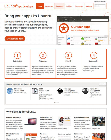
We’re happy to unveil the brand new Ubuntu App Developer website today, a place where developers who want to create Ubuntu applications can find all the information they need and get in touch with the Ubuntu app developer community to share ideas, ask questions and get all the news and events.

Ubuntu App Developer’s website new homepage
The brief
The goal of this project was to create a website that would centralise the best resources on developing Ubuntu applications; a place where developers could find not only all the tools and information necessary to get started on Ubuntu app development, but also a place where they can be a part of an engaged community of other developers who are equally eager to learn and happy to share their knowledge.
Our timeframe was very limited: just under 10 weeks to plan, research, design and build the site. This, of course, had an impact on what could be created. We spent quite a lot of time scoping down the project, making sure the essential information was included and the site was built in a way that it could grow organically, over time.

Planning the App Developer website
Research
Research is one of the most important parts of creating sites (or, to that matter, anything that people will use). As experienced designers, we can make informed guesses on what people will want to see on a given page, but sometimes people’s expectations can be quite different from our initial thoughts. With this in mind, we knew that even though we spent a few intense weeks sketching, brainstorming, covering the Millbank walls with post-its and wireframes, having day-long workshops and listening to what all the key people in this project had to say, ultimately, we had to put our thoughts in front of the developers we were making this site for. And so we did.

One of the many sketches that were done
John Oxton, the Web Team’s UX architect, as someone more qualified to go through this phase, will write a more detailed follow-up post that will focus mainly on the research phase of the App Developer site, the tools used, the main findings, the solutions, etc.
The brand, from a developer’s perspective
The Ubuntu App Developer website is part of the main Ubuntu family of websites. With this in mind, we had to make sure it adhered very closely to the Ubuntu brand guidelines. But we also wanted it to have a life of its own, so that it wouldn’t just be a copy of ubuntu.com.
One of the key assets of the Ubuntu brand guidelines are the Voice, Audience and Developer sliders, which are a tool in understanding what the design direction of any product should be, whether it is a banner, a brochure, a cd cover, a site, etc.

One of the detailed pages on the sliders in the Ubuntu brand guidelines
Here’s a quick overview of the sliders:
- The Voice slider determines whether a piece is representative of the Ubuntu community or if it’s representative of Canonical. This doesn’t reflect the position of the person creating the work, but of the work itself.
- The Audience slider determines the type of user you are talking to. The work can be consumer- or enterprise-oriented.
- The Developer slider determines whether the work is targeted towards end-users or developers. In this case, an advanced user would still not be a developer.
If you’re creating design assets for Ubuntu, you should be familiar with these: have a read of the guidelines as they go into a lot more detail, and do get in touch if you have any questions!
After talking to the stakeholders of this project, we were able to position the sliders as follows:
- Voice: Community
- Audience: Consumer
- Developer: Developer
This was the first time we created a website that was so directly targeted at developers. A brand is something that evolves over time, and this was a great opportunity to evolve the Ubuntu brand in this direction and to explore a new area of the guidelines that hadn’t been looked at in depth before.

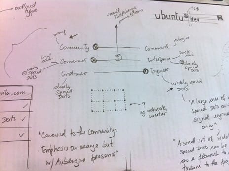
Some quick notes and sketches exploring the design direction for the site
We wanted to create something that conveyed the idea of blueprints. This led to a design that makes use of outlines, widely spaced dots and that is clean and direct.

The App Developer’s site navigation follows closely the one of the main Ubuntu sites, with its own flavour

Detail of one of the reusable components of the App Developer’s site
Second round of testing
Trying to get as much feedback from our target users as possible, we showed a more finalised site to a few more developers. Again, John will write about the research side of this project in more detail soon, here on the blog.
The road ahead
This project was a highly rewarding and highly intense team effort. Everyone worked incredibly hard, but we had a lot of fun. Too many great ideas for the site had to be put aside for the future, as our time was so constrained, but rest assured all these were captured in a very exciting roadmap.
The website is now in the hands of the fantastic Ubuntu App Developer community and the Canonical Community Team, and we hope to see it grow with lots of content created by anyone who would like to contribute. Have a look at the site and tell all your friends about it! We’d love to hear your thoughts.
Talk to us today
Interested in running Ubuntu in your organisation?
Newsletter signup
Related posts
Introducing a VSCode extension for Vanilla CSS Framework
The Vanilla CSS Framework is a utility class-based and customizable SASS library that is the go-to when it comes to styling websites and dashboards across the...
How we ran an effective sprint to refresh our website, Part 1
Part 1 of how we ran a design sprint to refresh our website. Sharing what worked, what didn’t, and lessons from designing for open source in mind.
A deep dive into our grid system and typography for the A4 format
We recently redesigned our whitepapers as part of our broader rebranding project. Let’s look at some of the ideas behind our approach to layout and...
